Firecracker
Chinese Restaurant
Nostalgic | Bold | Grounded
2025
About
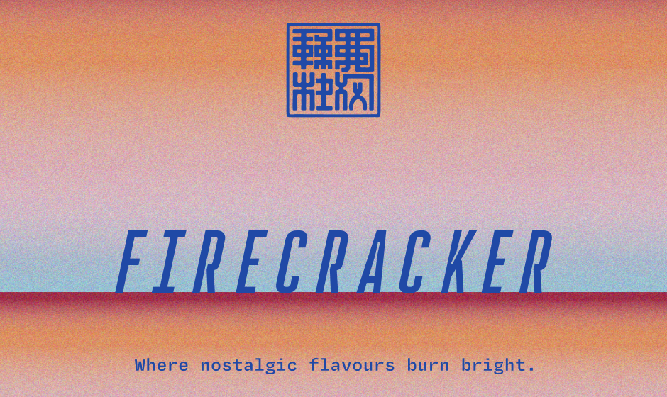
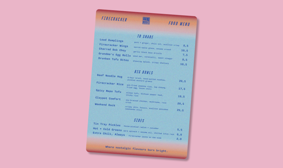
Where nostalgic flavours burn bright.
You Pick I Brand is a weekly design dare where my audience chooses the brief. Every Thursday, I run polls on social media asking people to vote on a niche business and three personality traits. By Monday, I deliver a full visual identity built from those choices. The series is playful, but it’s also purposeful. It lets me share how a brand identity takes shape — from personality and concept to final design — while building a portfolio of work rooted in real-world prompts. And honestly? The unhinged creative freedom experience has been a lot of fun!
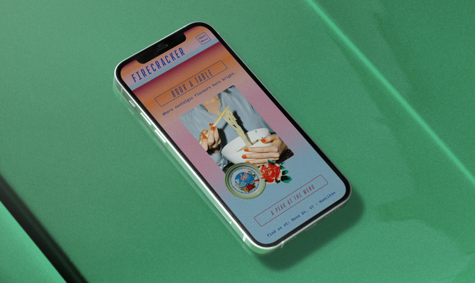
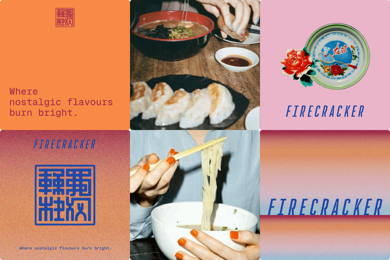
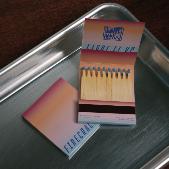
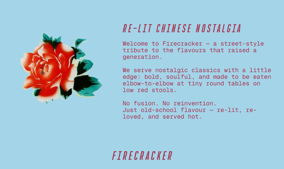
This fictitious brand reimagines the familiar Chinese restaurant aesthetic. Instead of predictable chopstick logos, bamboo motifs, and safe red-and-gold palettes, Firecracker leans into nostalgia with a bold edge — inspired by vintage Chinese packaging, communal dining culture, enamle plates, and street-food settings. The result is striking, playful, and grounded: a visual identity that honours tradition while refusing to feel cliché.
The creative challenge was finding the sweet spot — nostalgic enough to feel familiar, bold enough to feel fresh. The food concept pairs sophisticated flavours with a street food setting — small tables, low stools, served fast. The result is an identity that is distinctive enough to stand apart, but still manages to feel familiar.
Details
Client
Firecracker
Services
Branding | Concept Development | Web Design | Signage | Menu
Personality
Nostalgic | Bold | Grounded
Fun Fact
The name and colours are derived from vintage Chinese firecracker packaging.


PS. This project is available to extend in a real Brand Identity, if the personality and the colours match your brand vision (regardless of the service industry you are in) let’s chat!


