Branding & Web Design
Zee van Talent
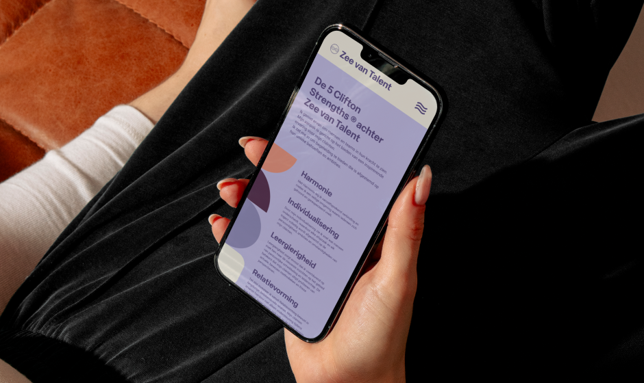
CliftonStrengths® Talent Assessment & Coaching
Insightful | Warm | Calm | Responsible | Friendly
2026
About
Zee van Talent supports private individuals and corporate teams in gaining clarity about their natural strengths.
As a certified Gallup CliftonStrengths® coach, they use the Talent Assessment as a foundation to help people understand what drives them, where their energy lies, and how they function at their best. Grounded in positive psychology, their approach focuses on recognising and strengthening existing talents rather than fixing perceived shortcomings. Through this process, individuals and teams learn to apply their strengths more intentionally, leading to greater confidence, stronger collaboration, higher productivity, and more energy in their work.
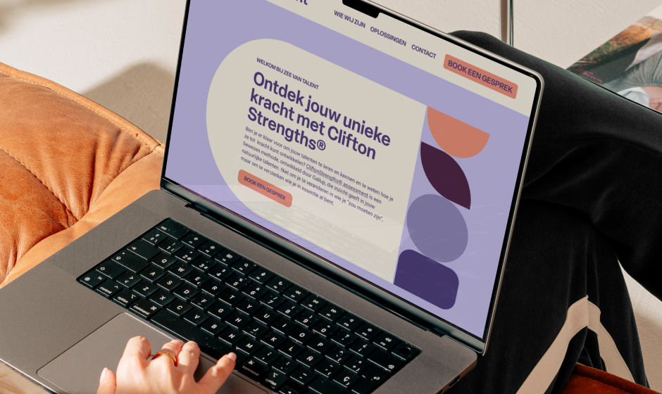
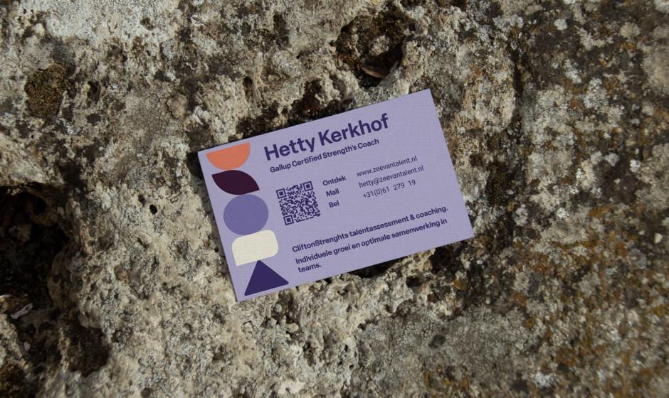
The biggest challenge in this journey was finding a visual language that felt equally welcoming to private individuals while remaining professional for corporate teams. The solution came through clarity guiding the visitor into the experience with the introduction of geometrical shapes. These shapes became a visual metaphor for talent: a perfect circle representing the individual as a whole; a pillar of four distinct forms symbolising a team, where different strengths find balance together; and a totem of five colourful shapes reflecting the Top 5 CliftonStrengths® — the essence of how a person naturally shows up in the world. The colour palette supports this inner journey as well: layered purples evoke depth, reflection, and the quiet work beneath the surface, while a warm peach introduces optimism and lightness, reinforcing the idea that this process is not about fixing what is lacking, but strengthening what already exists. All coming together in a clean, intuitive interface allowing both colour and geometry to guide the experience — shaping hierarchy, services, and pathways through form.
Details
Client
Zee van Talent
Services
Branding | Web Design |Stationary
Personality
Insightful | Warm | Calm | Responsible | Friendly
Fun Fact
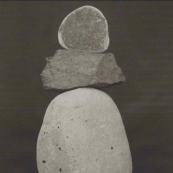
The shapes are inspired by rocks, and towers of rocks, which regardless of the different shapes and sizes are able to find a state of perfect balance.